Whether you’re a business owner, market analyzer, researcher, or data enthusiast, Polygram offers you powerful charts right at your fingertips.
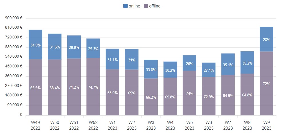
Bar
Bar charts are commonly used to compare different sets of data or to show changes in data over time.
Especially useful for displaying categorical data, such as survey results or sales figures, and can be customized with different colors and labels to enhance their visual appeal and effectiveness.
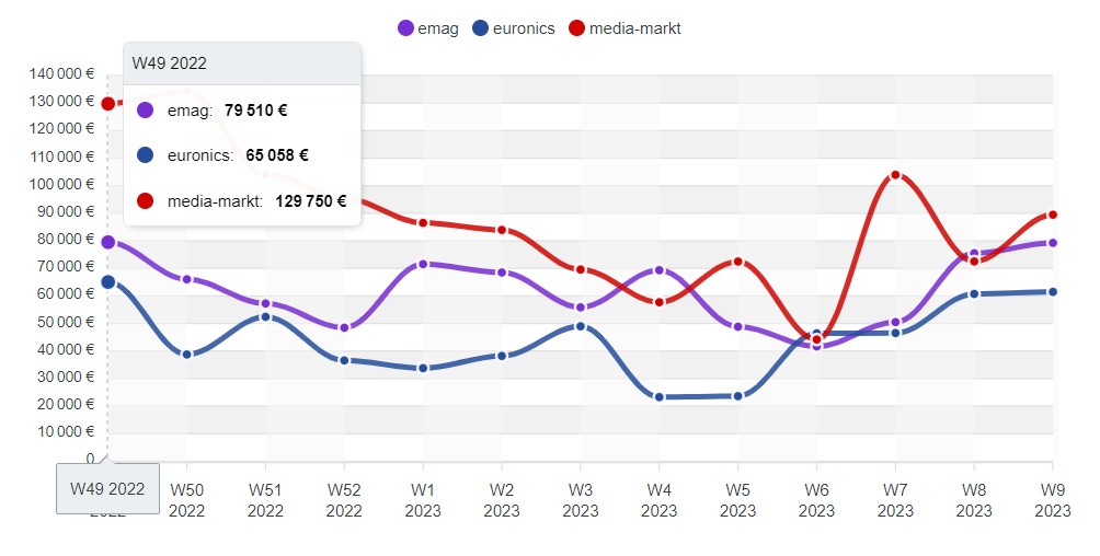
Line
Line chart displays series of connected dots or lines, representing a value at a specific point in time or along an axis.
It’s frequently used to show trends or changes in categorical and numerical data over time. It can be customized with different colors and labels to enhance their visual appeal, and highlights correlations between different sets of data.
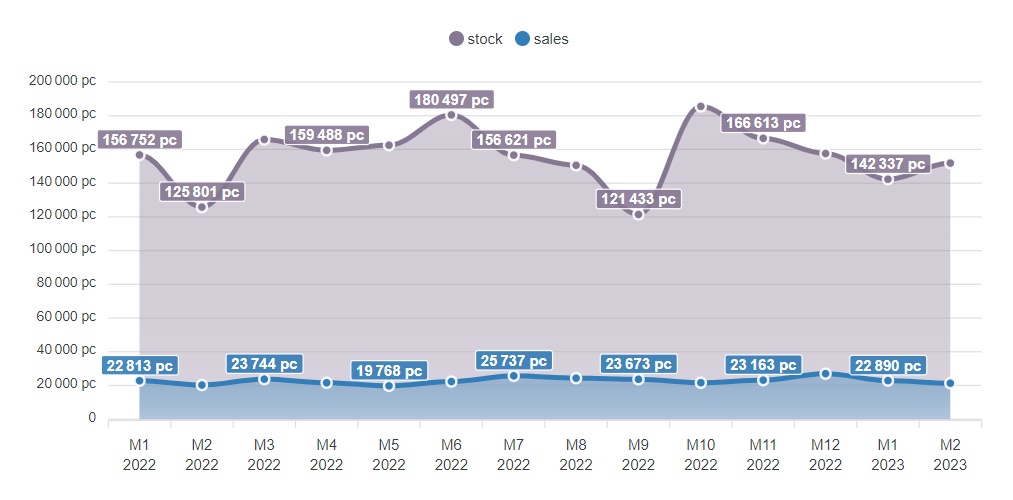
Area
An area chart is a graph that combines a line chart and a bar chart to show changes in quantities over time.
Area charts are commonly used to represent quantitative variations, such as changes in population or average performance in the long run.
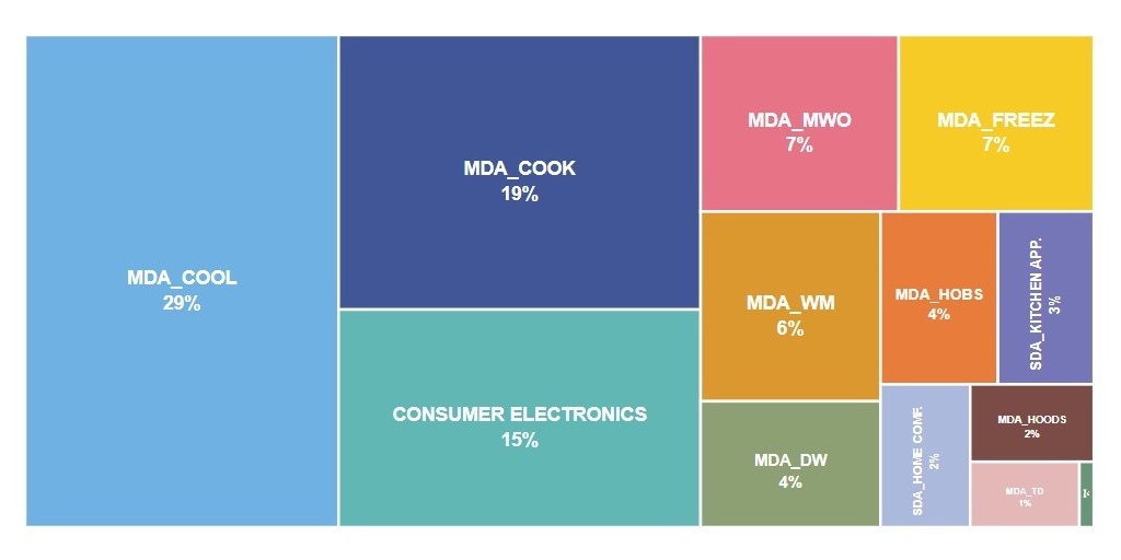
Treemap
Treemap displays hierarchical data in a rectangular format, similar to a tree. It consists of a set of nested rectangles, where the size and color of each rectangle represents a specific value or category.
Treemaps are commonly used for stock portfolios or website traffic, sales figures and representing product categories dominance.
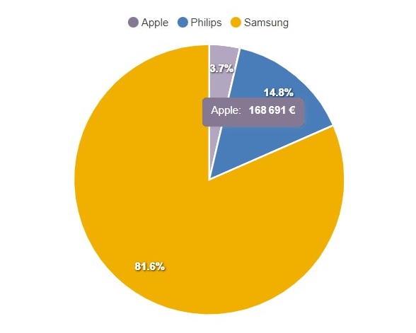
Pie
Pie chart displays data in a circular format, divided into slices or wedges that represent different categories or data points. Each slice of the pie chart represents a proportion of the whole, with the size of each slice proportional to the value being represented.
Pie charts are commonly used to display categorical data, such as market share or election results.
Charts
in motion
as you need
at your fingertips
Visualizing data has never been more intuitive or dynamic.
Interacting with charts has become a vital part of data analysis today. Polygram enables users to explore and analyze complex data sets in an intuitive way in order to see the data in a variety of formats.
To plot data with different scales or units of measurement on the same chart. Particularly useful when comparing data sets with vastly different values or scales.
Enabling users to quickly see how each data point contributes to the overall picture. This feature is particularly useful when analyzing complex data sets with multiple variables and categories.
Hide / Show particular series
Allowing users to focus on specific aspects of the data without being overwhelmed by the full range of data points. Users can highlight series on a chart and remove distractions to identify relationships or anomalies that may be hidden.
What if? - Building theories
Users can test various theories and hypotheses and gain a deeper understanding of their data by experimenting with different combinations of displayed series.
DRILL DOWN WITH
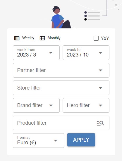
Filters
You can easily drill down and analyze data in granular detail from any angle. For example, identify trends, track the performance, and displaying comparisons.
Fields
Polygram supports configurable filters that allow users to isolate their data in order to explore trends and patterns across multiple dimensions.
A wide range of filter types are available, and can be configured each filter to suit their specific requirements per workspace:
Date range
Select
Multi-select
Checkbox
Search
Auto-suggest
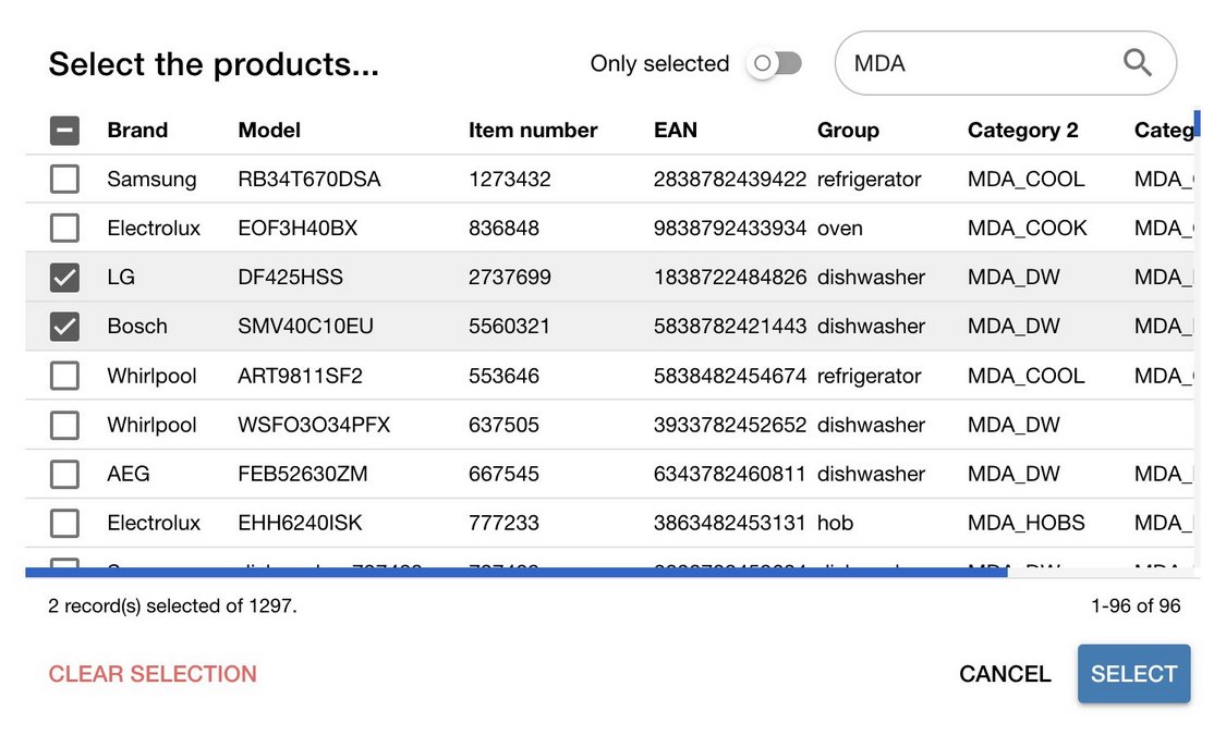
Selector dialog
Selector dialog offers a simple, user-friendly interface to quickly and easily select one or multiple items from a list.
Thanks to the built-in search capability, user can find exact item without having to navigate through a long list. For example, selecting multiple products from a bunch of categories.
SELECT COMPOSITION
Data formats
Granularity
Apart from choosing time interval, user can also determine the granularity of the displayed chart data. Explore automatically interpolates data when source is in different format.
Currently, the following levels are configurable:
Daily
Weekly
Monthly
Quarterly
Yearly
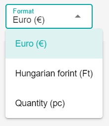
Format / Currency
Explore allows to set the preferred format that can be either a number or currency.
Polygram is able to convert one currency to other.
* Please note that currency conversion may only be available for select currencies.
SHARE YOUR DATA
Export
Whether you need to collaborate with others, present your findings, or simply keep a record of your results.
Export to Excel
On Explore, you can export the result in a spreadsheet or Excel format. It’s simple to use and can be customized to match your specific needs.
Copy to clipboard
Tables provide a “copy to clipboard” feature that allows you to immediately copy-paste the table data into your spreadsheet regardless to formatting.
Saving charts
With just one click, it’s easy to save your charts as PNG images that can be shared or embedded in other documents, presentations, or reports.
Try Polygram
Ready to take your business to the next level? Don’t wait any longer, contact us!